The Psychology of UI/UX: How Colors and Typography Impact User Behavior
Great UI/UX design isn’t just about aesthetics—it’s about influencing user behavior. The right choice of colors and typography can make the difference between a visitor engaging with your website or leaving in frustration. In this blog, we’ll explore how these design elements affect user perception, emotions, and decision-making.
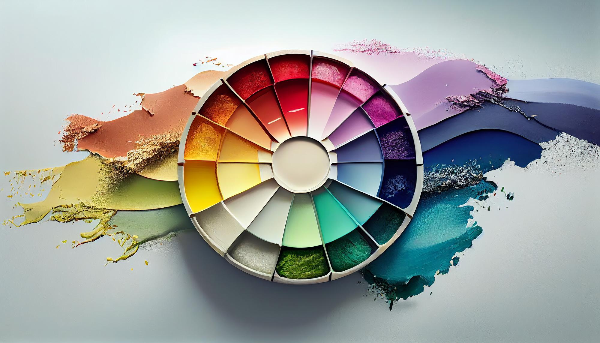
The Role of Color in UI/UX Design
Color psychology plays a crucial role in shaping user interactions. Different colors evoke specific emotions and reactions, making them essential in branding and UI design.
1. Emotional Associations of Colors
- Red: Energy, urgency, passion (e.g., sale banners, warnings)
- Blue: Trust, calm, professionalism (e.g., corporate websites, healthcare apps)
- Green: Growth, health, positivity (e.g., finance apps, wellness platforms)
- Yellow: Optimism, warmth, attention (e.g., call-to-action buttons, playful brands)
- Black: Elegance, luxury, sophistication (e.g., high-end brands, minimalist designs)
2. How Colors Affect Conversions
Studies show that the right color combinations can influence purchasing decisions. For instance, CTA buttons in contrasting colors like orange or red often perform better because they grab attention instantly. Meanwhile, softer tones can encourage trust and prolonged engagement.
The Impact of Typography on UX
Typography goes beyond font selection—it directly affects readability, engagement, and user retention.
1. Font Choices & Brand Perception
- Serif Fonts (e.g., Times New Roman, Georgia): Traditional, reliable, professional
- Sans-Serif Fonts (e.g., Arial, Helvetica): Modern, clean, approachable
- Display Fonts (e.g., Lobster, Pacifico): Creative, informal, attention-grabbing
2. Readability & Accessibility
Good typography ensures ease of reading across all devices. Factors to consider:
- Font Size: A minimum of 16px for body text improves readability.
- Line Spacing: Proper spacing enhances comprehension.
- Contrast: Sufficient contrast between text and background improves visibility, especially for visually impaired users.
Best Practices for Combining Colors & Typography in UI/UX
- Maintain Contrast for Readability: High contrast between text and background ensures content remains accessible.
- Use Color to Guide Attention: Key elements like CTA buttons should stand out.
- Keep Typography Consistent: Avoid using too many font styles within a single interface.
- Test with Real Users: A/B testing different color schemes and fonts helps identify the most effective combinations.
Understanding the psychology behind colors and typography is essential for creating an intuitive and engaging user experience. By strategically using these elements, designers can enhance usability, evoke the right emotions, and ultimately drive user actions.
Do you want to optimize your website’s UI/UX? Contact us today for expert design solutions! 🚀