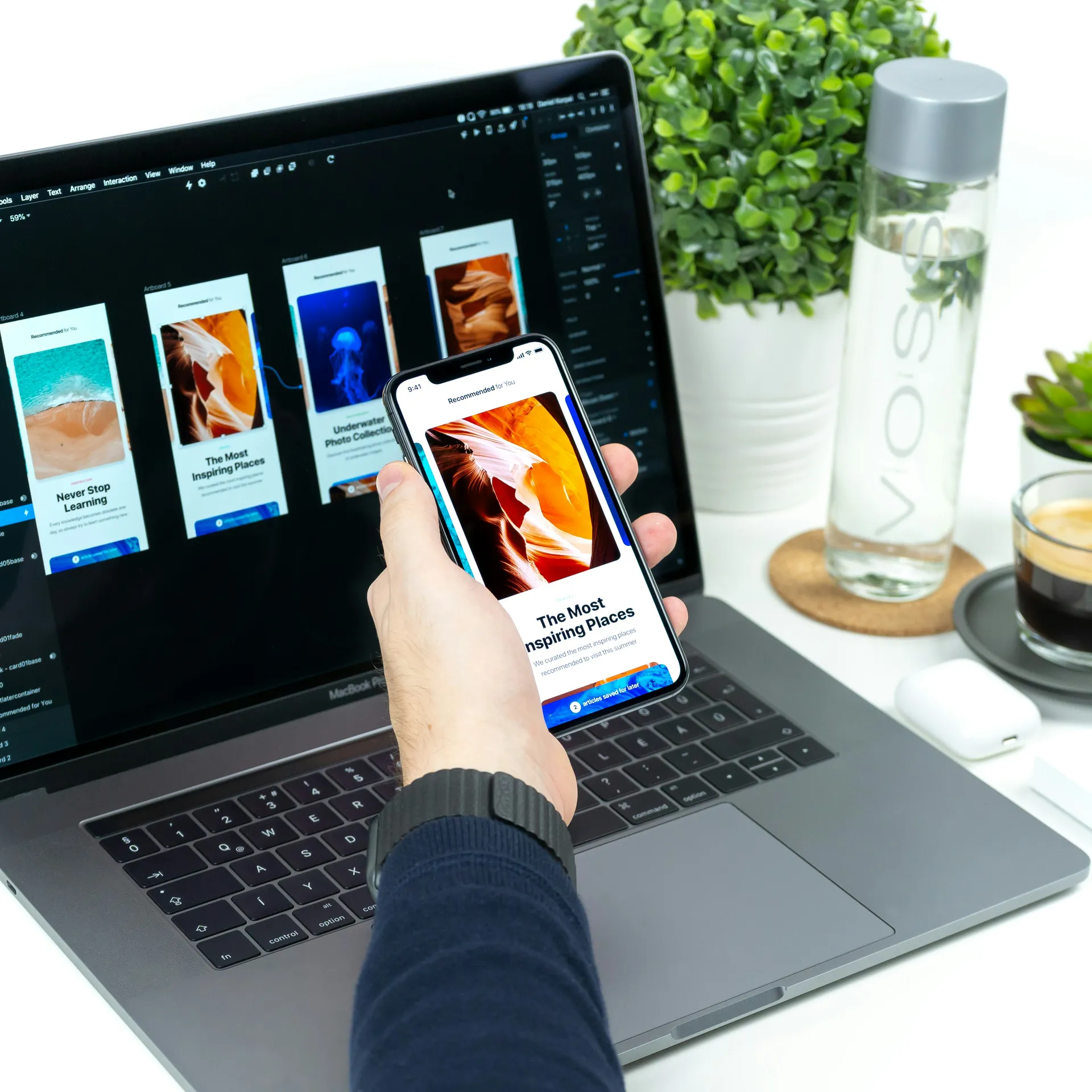
Mobile-First Design: Why It’s No Longer an Option but a Necessity
The world has gone mobile, and so should your design strategy. With mobile traffic surpassing desktop, adopting a mobile-first approach is not just recommended—it’s essential for delivering a seamless user experience. In this article, we explore why mobile-first design is critical and how to implement it effectively.
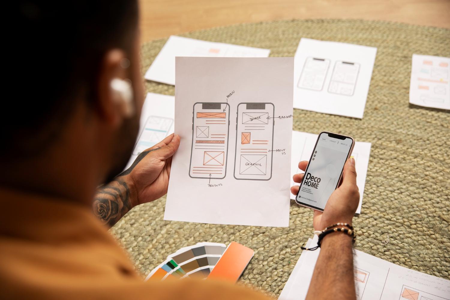
What is Mobile-First Design?
Mobile-first design is a strategy where the design and development of a website or application begin with the mobile version before scaling up to larger screens. This approach ensures that the most critical content and features are prioritized for smaller screens, creating a more efficient and user-friendly experience.
Why Mobile-First?
- Growing Mobile Usage: Over 50% of global internet traffic comes from mobile devices.
- SEO Benefits: Google prioritizes mobile-friendly websites in search rankings.
- Better Performance: Mobile-first sites tend to load faster and offer a smoother experience.
- Enhanced User Experience: Prioritizing essential elements leads to cleaner, more effective interfaces.
Key Principles of Mobile-First Design
1. Prioritize Content
Start by displaying the most crucial information first. Avoid unnecessary elements that might clutter the small screen.
2. Responsive Design is a Must
Use flexible grids and scalable elements to ensure a seamless transition across different screen sizes.
3. Optimize for Touch
Ensure buttons, links, and interactive elements are easily tappable and accessible for thumb navigation.
4. Focus on Performance
- Minimize heavy scripts and large media files.
- Use lazy loading to optimize loading times.
- Implement caching strategies to improve speed.
5. Test Across Devices
Regularly test your design on various mobile devices to identify usability issues and ensure consistency.
Best Practices for Mobile-First Implementation
- Design for Speed: Use lightweight assets and optimize images.
- Adopt Progressive Enhancement: Start with the simplest mobile layout and add complexity for larger screens.
- Simplify Navigation: Implement easy-to-use menus and intuitive user flows.
- Use Mobile-Friendly Fonts & Colors: Ensure readability and accessibility.
- Leverage Mobile-Specific Features: Incorporate geolocation, push notifications, and other mobile-native functionalities.
Conclusion
A mobile-first approach is no longer an option—it’s a necessity in today’s digital landscape. By prioritizing mobile usability, businesses can improve SEO, performance, and user engagement, ensuring long-term success.
Need help optimizing your website for mobile? Contact us today for expert web design solutions! 🚀