Dark Mode UI: Trend or Must-Have in Modern App Design?
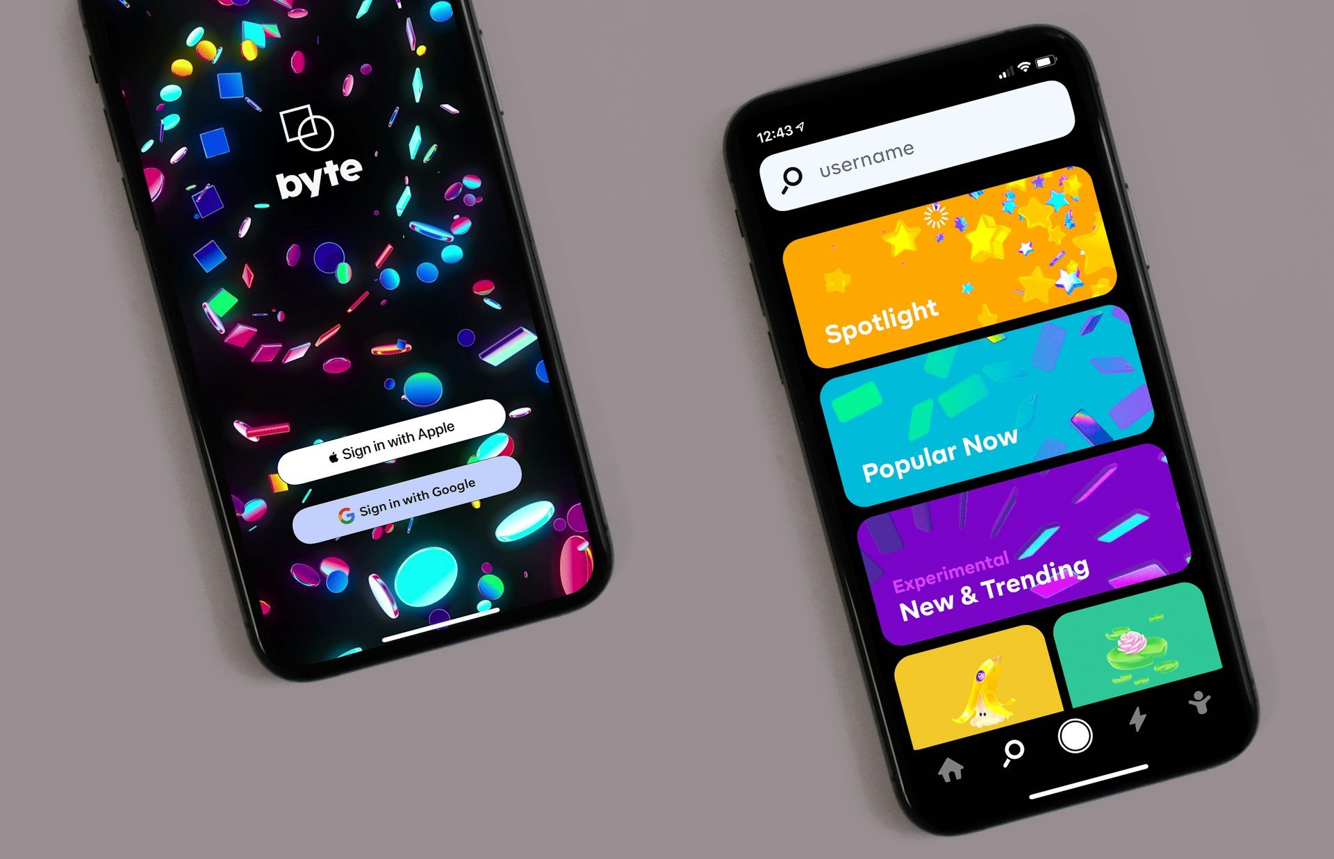
Dark mode has become a dominant feature in modern UI/UX design. From operating systems to websites and apps, major platforms like Apple, Google, and even social media apps like Twitter and Instagram offer dark mode options. But is dark mode just a trend, or does it have real usability benefits? In this blog, we'll explore the advantages of dark mode, when to use it, and best practices for implementing it in your designs.
Why Dark Mode is Popular
1. Reduces Eye Strain
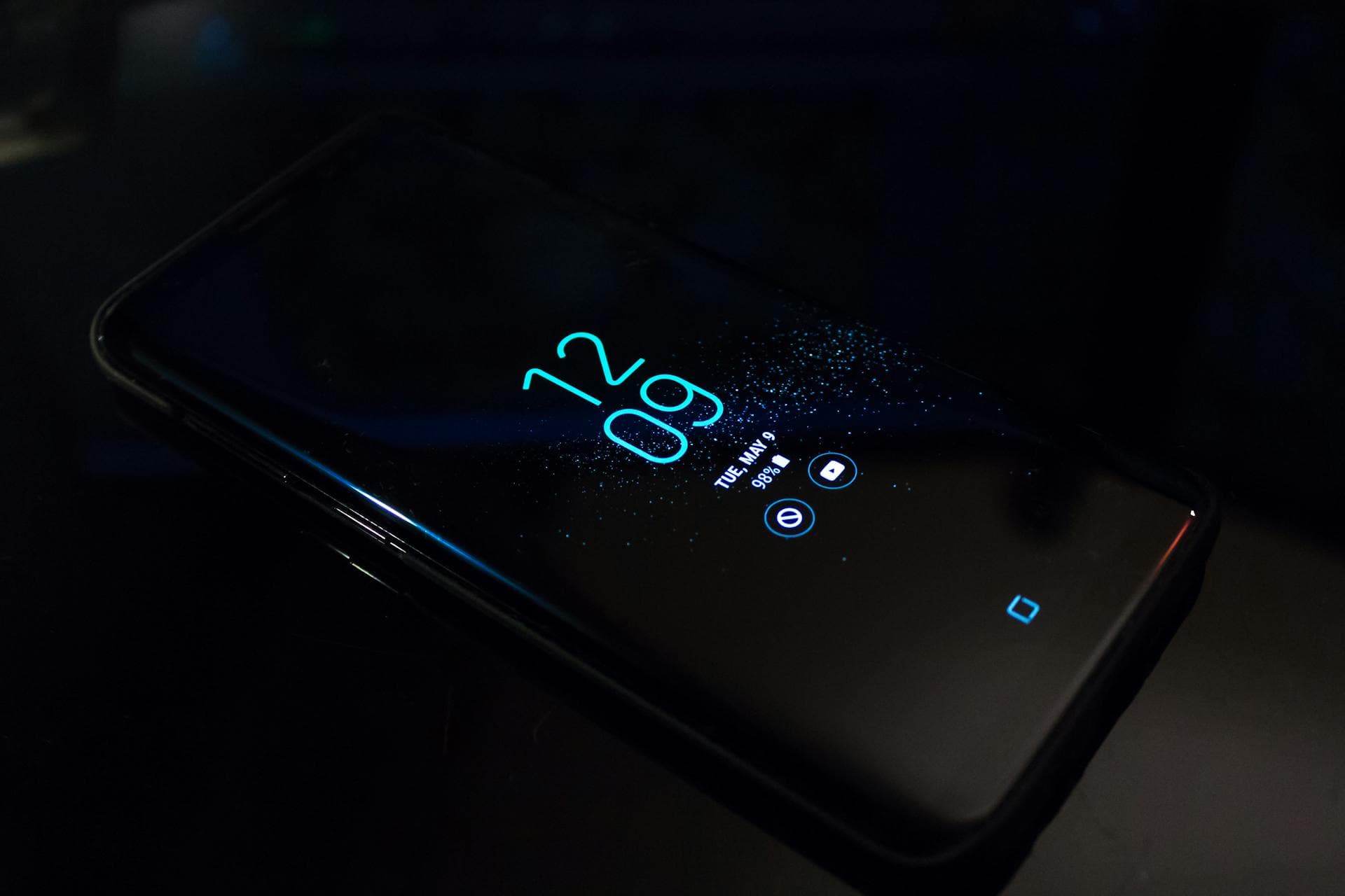
Dark mode minimizes blue light exposure and glare, making it easier on the eyes, especially in low-light environments. Many users report less eye fatigue when using apps in dark mode at night.
2. Saves Battery Life
On OLED and AMOLED screens, dark mode helps conserve battery by turning off individual pixels in dark areas. Apps like YouTube and Google Maps have seen significant power savings when using dark mode.
3. Enhances Aesthetics
Dark mode offers a sleek, modern look that many users find visually appealing. It provides a contrast that makes UI elements stand out, giving a premium feel to applications.
4. Improves Focus on Content
For apps that involve reading (e.g., eBooks, messaging apps, and developer tools), dark mode reduces distractions and makes text pop, improving readability.
Challenges of Implementing Dark Mode
While dark mode has advantages, it’s not always the best solution for every UI. Here are some common challenges:
1. Contrast Issues
Some dark mode designs suffer from poor contrast, making text hard to read. Always ensure enough contrast between text and background colors.
2. Not Ideal for All Content Types
For text-heavy content, a light background is often better. Studies suggest that black text on a white background is easier to read for long-form content.
3. Design Complexity
Maintaining a seamless switch between light and dark mode requires additional design and development effort. Developers must ensure elements look good in both modes.
Best Practices for Dark Mode UI
To implement dark mode effectively, follow these guidelines:
✅ Provide a Toggle Option
Always allow users to switch between light and dark mode manually. Auto-switching based on time (e.g., day/night) is also a good option.
✅ Use True Blacks for OLED Screens
For OLED devices, pure black (#000000) saves power. However, for readability, using a dark gray background (#121212) is often better.
✅ Ensure Sufficient Contrast
Make sure text is readable by following WCAG (Web Content Accessibility Guidelines) contrast ratios.
✅ Test in Different Lighting Conditions
What looks good in a dark room may not work in daylight. Always test your UI in various environments.
Conclusion
Dark mode is more than just a trend—it's a usability feature that improves visual comfort, saves battery life, and enhances the overall user experience. However, it's not a one-size-fits-all solution. By following best practices and allowing users to choose their preferred mode, you can create a seamless and accessible experience for everyone.